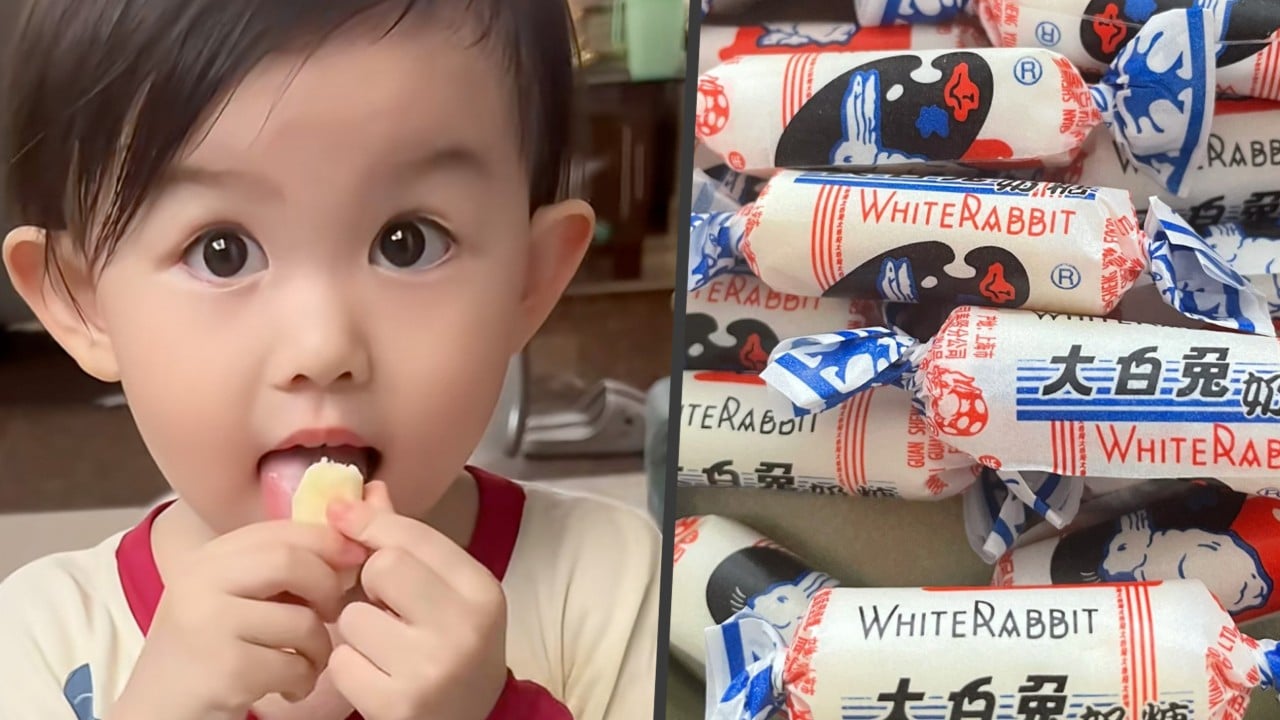
You unwrapped it slowly. You ate the edible rice paper lining without a second thought. If you grew up anywhere near East Asia, the White Rabbit creamy candy tastes like pure childhood. But a simple piece of vintage packaging just caught fire across Western social media, proving that great visual identity transcends language.
A single post on the platform X by user @weeabob displayed the iconic blue, red, and white candy wrapper flat against the screen. It pulled in millions of views and hundreds of thousands of likes almost overnight. Western internet users stared at the leaping rabbit, the bold primary colors, and the clean typography, labeling it an absolute masterstroke of graphic design. Tattoos, custom T-shirts, and phone cases quickly followed. Don't forget to check out our previous article on this related article.
Let's look at why this specific aesthetic struck a chord right now.
The History Behind the Blue and Red Motif
White Rabbit didn't start with a rabbit at all. Back in 1943, the Shanghai ABC Candy Factory cooked up a rich, chewy milk sweet modeled after British confections. The original wrappers featured Mickey Mouse. If you want more about the context of this, Cosmopolitan provides an in-depth summary.
Everything changed in 1959. To commemorate the tenth anniversary of the People's Republic of China, the state-owned enterprise rebranded the product. The mouse vanished. The leaping white rabbit took its place, flanked by distinct blue-and-white borders.
During decades of severe material scarcity, getting your hands on this candy was a rare treat. People treated the rich milk nuggets as genuine luxury goods. Seven pieces were famously marketed as equal to a single glass of milk, giving the sweet a functional value alongside its sugary taste. That history baked a deep sense of emotional nostalgia into the wrapper itself.
Even diplomats knew its weight. During President Richard Nixon's historic 1972 visit, Premier Zhou Enlai famously gifted the candy to the American delegation.
Why Modern Designers Are Obsessed
Today's digital aesthetic is dominated by sterile minimalism. Tech companies scrubbed character, texture, and personality from corporate logos in favor of flat, corporate sans-serif designs.
That explains the sudden backlash and craving for authenticity.
When international audiences stumbled upon the White Rabbit wrapper, they found something untouched by modern corporate homogenization. The design uses raw, unadulterated primary colors. The typography balances bilingual text seamlessly without looking cluttered. The borders feature clever positive-and-negative rabbit silhouettes that frame the central leaping mascot with striking geometric balance.
It looks like a miniature vintage art poster rather than a piece of disposable trash. Designers love it because it relies on bold lines and high-contrast hues rather than cheap digital gradients. It feels tactile, honest, and permanent in an era of throwaway digital culture.
How a Legacy Brand Survived the Modern Market
Many heritage brands panic when they age. They try to modernize by erasing their roots, swapping out classic logos for generic corporate refreshes that alienate their core audience.
Shanghai Guan Sheng Yuan Food, the company behind the candy, took a much smarter path. They kept the core product completely intact. The original red, blue, and white wrapper remains untouched for the classic milk flavor.
At the same time, the brand leaned hard into smart collaborations. They partnered with fashion labels, launched milk tea and ice cream lines, and expanded into alternative flavors like red bean, corn, yogurt, and durian. They even turned the iconic mascot into plush toys and stationery.
This balance protects the heritage while capturing new revenue streams. You can scale a business globally without losing the exact visual soul that got you there. Authenticity cannot be manufactured in a corporate boardroom. Sometimes, the best strategy is simply letting a masterpiece from 1959 speak for itself.